Capturing attention
on the trade show floor is not only a necessity… it’s the reason for exhibiting
in the first place. Not every company
has the budget for massive custom exhibits, but that doesn’t mean small exhibit
spaces have to be ineffective.
A few examples will
help illustrate the reasons a trade show exhibit would fail to capture
attention. Of course, the photos have
been altered to protect the innocent, but the illustrations are still
relatable.

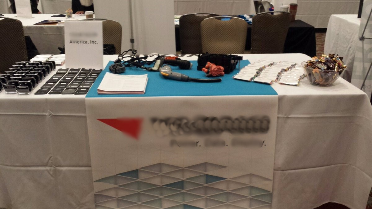
This example boasts
unidentified, rather odd-looking gadgets on the table, which are presumably
products. The products consume a
fractional part of the display; the swag consumes far more of the table real
estate.
The logo is displayed
only once, at knee height. The logo may
be on some of the swag, but it is difficult to see. The table-front signage does have three words
under the logo, but they are non-descriptive nouns which don’t really help
explain what the company does. The only
graphic, a cubic design, does not serve to inform about the company
either.
And, of course, there
is no one actually at the display to talk with prospects. It is impossible to tell what the value
proposition of this company is and most attendees will likely walk right by.
How this could be
improved:
- Feature the company
name, logo and slogan on top of the table.
This can be done with a small banner stand or even replacing the generic
white paper in the acrylic stand with a glossy printed piece in a nicer frame. - Invest in display
stands for the products, which will bring some height to the display and make
it more interesting. Custom-fabricated
displays would not be a significant investment to increase the visual
impact. But if budget is really tight, perhaps
there is something at the local office supply store suitable for the
purpose. Displays should include short
descriptions of what the product is and highlight the main benefit it offers
the consumer. - Add standard
literature racks to bring height while infusing color and vertical real estate
to showcase brand images and messaging. - Reduce the swag to
consume a smaller portion of the table space and bring the focus back to the
products, replenishing as needed throughout the show. - Ideally, a custom
graphic backwall should be added to maximize messaging opportunities. Even a pipe and drape backwall with basic
signage, as offered by the show organizer, would amplify noticeability while
providing some additional real estate for messaging. The upgrade is usually a small, but very
wise, additional investment.
Granted, this is a small table space, not a full booth. Many exhibitors who rent the smallest space available don’t think beyond a table and chair set-up as shown above. However, a lot can be done with a small space and some expert help. Rethink Brands hosted the 8’x10’ exhibit shown here. High impact, inviting and clear on purpose, this booth stood out far and beyond the neighboring booths which featured simply set-up tables such as the previous example.

The same principles
apply but become even more crucial with larger spaces, as seen below.

At most shows, a
10’x20’ exhibit space requires an investment of several thousand dollars. This company chose to fill the bland gray
space with twin banner stands, a low obelisk and a small table overrun with literature. This exhibit features nothing to attract the
eye or pique the interest of show attendees.
The signage is
confusing – the generic header sign and the obelisk feature the name of a
group, presumably a holding company or parent.
The identical banner stands feature an abstract graphic, a made-up word
which is presumably a product name, a confusing tagline which seems to be
promoting said product, and a website that seems to relate to none of these
things.
The literature is
impossible to read from the aisle, as it is lying flat. Passersby will likely deem that it is not
worth the effort to see what it is about, rather than walk in to pick up some
paper.
Two people are
sitting at the table already, but they might just be show attendees who decided
to take a break; their casual clothes make it unclear.
With the exception of
process blue accents, color is non-existent in the space.
How this could be improved:
- If the two people are
brand ambassadors, they should look the part.
Booth staff should be easily identifiable, with a uniform of sorts. Jeans and casual boots are not it. Most companies elect a branded polo or
button-down shirt with neat slacks to offer quick identification of brand
ambassadors. At a minimum, the brand
ambassadors could be wearing a name tag with clothing in simple neutrals or a
color that is aligned with the branding.
Keep brand ambassadors standing, ready to engage with attendees. - An engaging element
of some kind should be incorporated into the booth, with the goal of drawing in
attendees. Some very basic ways this
could be accomplished:- Simply offer branded
swag or even a bowl of mints
- Provide empty chairs
for show attendees to take a quick break
- Offer a small
charging station for cell phones
- Host a product demo
or sample, depending on the nature of the product
- Play a basic
interactive game (wheel of chance, duck pond, etc.)
- Add a fishbowl
business card drop
- Set up a backdrop and
props for selfies, sharable on social media
- Simply offer branded
- Make it clear what is
being promoted. Clarify the relationship
between the parent company, the website and the product featured on the banner
stands. Or, choose just one to promote. The banner stands could read “Product X is a
(description) from Company Y. Featured
on WebsiteZ.Com.” - Use that back wall
real estate! A simple banner or poster
with a product photo and short value proposition would have a big impact
here. Even better would be a monitor
scrolling written testimonials, product/service demos or related imagery. These could both add color and interest. - Add stand-alone floor
literature racks on the aisle periphery of the booth to fill out some of the
empty spaces on the floor, creating zones around which booth staff can talk
with attendees. This will also increase
the visibility and accessibility of literature and messaging. - Move the trash can
away from the center spot in the exhibit.

This exhibit property from HemoCue is the same size rental space, a 10’x20’ exhibit, but it is the polar opposite of the previous example. The striking red color paired with accent lighting offers a real eye-opener. The vertical real estate features clear branding, a succinct value proposition and related graphic imagery. The front and right side counters offer areas for swag, while literature is easily accessed from these and several other points inside and outside the perimeter of the exhibit. These lowered front and side counters are thoughtful to show attendees, as they offer a welcome place to rest heavy bags while the product display on the left rear shelf or the video on the monitor are viewed.
Acer designed and
built this exhibit (which admittedly lends a slight bias), which earns an A+
all around!